


How Plymouths Different Neighbourhood Identities Shape Brand Strategy

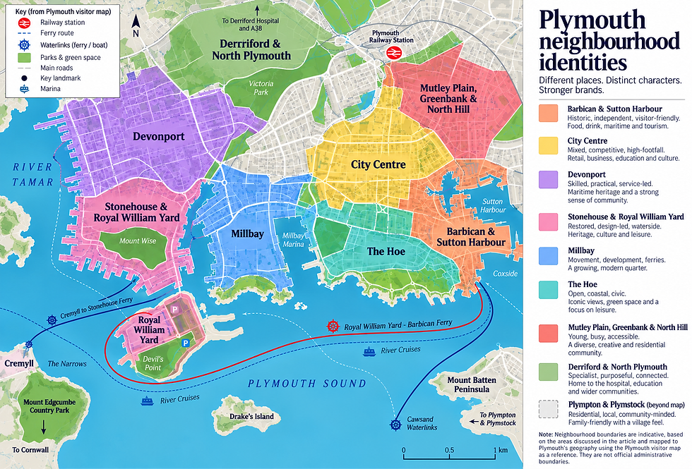
Plymouths Different Neighbourhood Identities
Plymouth is one city, but it does not speak with one voice. A brand that feels right on the Barbican can feel out of place in Derriford. A café near the Hoe may lean on sea air and leisure, while a training provider near Devonport might need to sound grounded, skilled, and practical. That matters because place shapes trust. People read signals quickly. The words on a sign, the colours on a website, the tone of a leaflet, the way a shopfront feels from the pavement, all of it tells them whether a business “gets” the area. Good local branding in Plymouth starts with a simple question: which version of the city are you speaking to?
Plymouth has a shared story, but many local moods
Plymouth has powerful common themes. The sea, naval history, migration, education, public service, sport, and a strong sense of resilience all run through the city. Those themes can support many kinds of brands.
Yet the city changes character fast from one area to the next. Walk from the Barbican to the city centre, then up to Mutley Plain or out towards Derriford, and the setting, pace, and expectations shift.
For a business, that does not mean inventing a fake personality for each postcode. It means reading the room.
A strong brand strategy asks:
What do people already associate with this part of Plymouth?
What kind of language feels natural here?
Should the brand feel polished, practical, creative, traditional, relaxed, or expert?
Does the area call for heritage, convenience, community, aspiration, or independence?
Which local references help, and which feel forced?
The best answer often sits between consistency and local awareness. A company should still be recognisable everywhere, but it may flex its messaging, imagery, offers, and tone by area.
The Barbican and Sutton Harbour reward character and craft
The Barbican is one of Plymouth’s most distinctive areas. It carries the weight of maritime history, narrow streets, independent shops, galleries, pubs, restaurants, and visitor footfall. Sutton Harbour adds marina life, food, and waterside leisure.
A brand here can often afford more personality. People expect charm, texture, and a sense of place. A plain, generic identity may struggle because the surroundings already have so much character.
Businesses in this area often benefit from:
Story-rich language
A restaurant, gallery, or boutique can talk about provenance, local makers, craft, harbour life, and Plymouth’s seafaring past.
Warm visual details
Natural materials, hand-drawn elements, deep blues, off-whites, aged greens, brass, wood, and stone textures can fit the area without feeling theatrical.
A slower, more sensory tone
Words like “made”, “poured”, “caught”, “baked”, “restored”, and “chosen” can feel stronger than slick sales language.
That said, heritage can easily tip into pastiche. A modern business does not need ropes, anchors, and old maps everywhere. The goal is to borrow the area’s confidence, not dress up as a museum.
For example, a small food brand near the Barbican might use local sourcing and maritime cues. A legal or accountancy firm in the same area could use the harbour setting more lightly, with calm colours and plain language that suggest stability rather than tourism.
The Hoe gives brands space, leisure, and civic pride
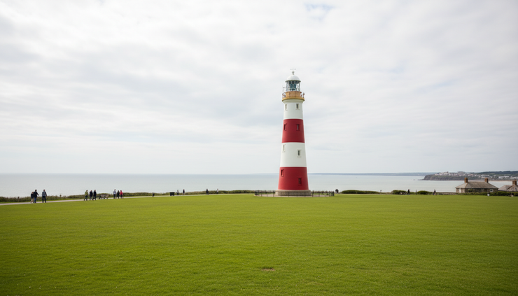
Plymouth Hoe has a different identity. It feels open, public, and panoramic. It connects the city to the Sound, Smeaton’s Tower, naval memorials, walking routes, family outings, and summer events.
Brands near the Hoe can draw on a sense of wellbeing, pride, and fresh air. This works well for hospitality, fitness, tourism, events, lifestyle, and premium services.
The Hoe supports brand ideas such as:
Clarity and calm
Coastal confidence
Outdoor living
Family-friendly leisure
City pride without being loud
A hotel, for instance, may use elegant coastal photography and a calm tone. A fitness studio might focus on movement, strength, and fresh starts. A café could lean into morning walks, sea views, and relaxed routines.
The risk is becoming too broad. “By the sea” is true, but many brands can say it. Better branding finds a more specific angle. A breakfast spot might own “post-swim coffee”. A guesthouse might speak to quiet winter weekends as much as summer visitors. A local events brand might connect the Hoe with shared city moments, not just views.
Devonport speaks to skill, service, and durability
Devonport has one of the strongest identities in Plymouth. Its naval links, dockyard history, working culture, and ongoing connection to defence give the area a practical, skilled, and service-led character.
A brand that operates here should avoid sounding flimsy or overly polished. People may respond better to directness, usefulness, and evidence. This is especially true for training providers, trades, engineering firms, community services, transport businesses, and organisations linked to employment.
Brand cues that can work well in and around Devonport include:
Strong, simple typography
Plain English
Practical benefits
Clear proof of skill
Respect for heritage
A tone that feels capable rather than glossy
That does not mean every brand must look industrial. A community café, health service, or youth organisation may still feel warm and welcoming. The key is sincerity. Devonport does not need romanticised grit. It needs brands that show up with respect and substance.
For a company, this can shape everything from website copy to signage. “Reliable repairs from qualified local engineers” may carry more weight than a grand promise. Case studies, accreditations, long-term service, and clear opening times can become important branding tools because they support trust.
Stonehouse, Royal William Yard, and Millbay suit modern heritage
Stonehouse, Royal William Yard, and Millbay show how Plymouth blends old structures with newer uses. Royal William Yard, in particular, carries a strong sense of restored heritage, dining, apartments, events, and waterside living. Millbay adds a feeling of movement, development, ferries, and city-edge regeneration.
Brands in these areas often sit between old and new. They can feel refined without becoming stiff. They can use heritage without sounding dated.
This area can suit:
Design-led hospitality
Creative studios
Property and interiors
Independent retail
Premium personal services
Cultural events
The branding opportunity lies in contrast. Old stone, water, and large architectural forms pair well with clean design and careful language. A brand can use muted colours, generous spacing, editorial-style photography, and confident short copy.
For example, a hair salon at Royal William Yard could avoid loud beauty clichés and instead lean into calm, considered service. A bar might use the building’s scale and history as a backdrop, while keeping the offer modern and simple.
Millbay may call for a slightly more mobile tone. It has links to travel, transition, and new homes. Brands there can speak to convenience, connection, and a city that is still changing.
Mutley, Greenbank, and North Hill need energy and accessibility
Move up towards Mutley Plain, Greenbank, and North Hill, and Plymouth feels younger, busier, and more everyday. Students, renters, commuters, takeaways, independent cafés, health practices, and small services all mix here.
This is not the place for distant, over-designed branding unless the business has a clear reason. People often need quick decisions, fair prices, late openings, easy booking, and a sense that the brand fits real routines.
A brand in this part of Plymouth may do well with:
Friendly, direct copy
Clear offers and prices
Strong window messaging
Mobile-friendly booking
A tone that is lively but not childish
Visuals that feel fresh and unpretentious
For student-facing businesses, the temptation is to sound too slangy. That can date quickly and feel fake. Better to be clear, useful, and a little playful. A laundrette, dentist, café, gym, or letting agency can use warmth and speed as part of its identity.
Greenbank also has a residential, community feel in places. A local food shop or clinic might combine convenience with neighbourhood trust. North Hill, with its student movement and route into the city, can support brands that feel quick, social, and easy to access.
The city centre needs clarity and confidence
Plymouth city centre has to serve many audiences at once. Shoppers, workers, students, families, visitors, and people passing through all use it differently. The scale is larger, the competition is more visible, and attention is shorter.
Here, brand strategy often needs to work harder. A business cannot rely only on local charm. It needs quick recognition and a clear reason to stop.
City centre brands usually benefit from:
Simple messaging that can be understood in seconds
Strong visual contrast
A memorable name or graphic device
Clear signs from different walking angles
A reason to choose them over nearby options
This does not mean shouting. It means removing confusion. A shopfront should tell people what the business is, who it is for, and why it is worth entering.
The city centre also carries Plymouth’s post-war architecture and civic planning history. Some businesses may choose to work with that clean, modernist feel. Others may soften it with warmer materials and human touches. Both can work if the overall identity feels intentional.
For regional or national brands opening in Plymouth, the city centre is a useful test. A store that ignores local feeling may appear detached. Small local references, staff knowledge, community links, and Plymouth-specific product choices can help a larger brand feel more rooted.
Derriford and the north of the city value expertise and ease
Derriford has a different rhythm from the waterfront and central neighbourhoods. It is closely associated with healthcare, science, education, business parks, and major road routes. People often travel there for a purpose.
That gives the area a more functional identity. Brands in Derriford, Estover, Roborough, and nearby northern parts of Plymouth often need to communicate competence, access, and reliability.
This can shape brand strategy in practical ways:
Area quality | Brand response |
People often arrive by car | Make directions, parking, and opening times clear |
Services may be specialist | Explain expertise in plain language |
Decisions can be practical | Focus on outcomes, time, and trust |
The setting feels less tourist-led | Use real service value rather than scenic imagery |
A private clinic, training centre, technology supplier, or trade counter in this area should not hide useful information behind vague brand language. People want to know what is offered, how to get there, what happens next, and whether the team knows its field.
That does not mean the brand should feel cold. In healthcare and education especially, warmth matters. The sweet spot is calm, clear, and capable.
Plympton, Plymstock, and suburban Plymouth call for trust and community
Plympton and Plymstock have their own identities, shaped by family life, schools, local high streets, commuting, green space, older villages, and strong community ties. They often feel separate from central Plymouth, even while connected to it.
Brands here should avoid treating the area as “just outside the city”. Local identity matters. People may choose businesses because they feel nearby, known, and dependable.
Good brand cues for suburban Plymouth include:
Neighbourhood familiarity
Clear service promises
Family and household relevance
Local sponsorship or community involvement
Friendly photography with real settings
A tone that feels steady and approachable
For example, an estate agent in Plymstock might reflect coastal and family living. A home improvement company in Plympton could focus on tidy work, clear quotes, and local recommendations. A children’s activity provider may build its identity around safety, routine, and confidence for parents.
These areas reward consistency. A brand that turns up in local search, on the high street, at community events, and through word of mouth can become part of the mental map.
How companies can adapt without losing their core identity
A company with customers across Plymouth does not need a separate brand for every neighbourhood. That would create confusion. The smarter route is to define a stable core, then flex the local expression.
Think of it in three layers.
Core identity
This stays the same everywhere. It includes the name, values, main visual system, service standards, and basic tone.
Local emphasis
This changes depending on the area. A brand might highlight convenience in Mutley, heritage near the Barbican, expertise in Derriford, and community trust in Plympton.
Local proof
This makes the message believable. Examples include area-specific testimonials, photos of real local work, references to nearby landmarks, local partnerships, and service pages written for how people in that area search and decide.
Here is a simple way to make those choices:
Plymouth area | Likely identity | Branding angle |
Barbican and Sutton Harbour | Historic, independent, visitor-friendly | Character, craft, provenance |
The Hoe | Open, coastal, civic | Wellbeing, leisure, pride |
Devonport | Skilled, practical, service-led | Trust, trade, durability |
Royal William Yard and Stonehouse | Restored, design-led, waterside | Modern heritage, quality |
Mutley and North Hill | Young, fast-moving, accessible | Ease, value, personality |
City centre | Mixed, competitive, high-footfall | Clarity, recognition, confidence |
Derriford and the north | Specialist, purposeful, connected | Expertise, access, reliability |
Plympton and Plymstock | Residential, local, community-minded | Familiarity, care, consistency |
The key is not to stereotype people. Neighbourhood identity is a guide, not a rulebook. Every area contains many audiences. Still, the physical setting and local habits influence what feels natural.

Practical questions before shaping a Plymouth brand
Before choosing colours, copy, or campaign ideas, a business should ask a few grounded questions.
Where do customers first meet the brand?
A shopfront, Google listing, van, website, market stall, referral, or local event will each need different signals.
What does the area already give us?
A waterfront location may give atmosphere. A suburban location may give trust. A business park may give access and credibility.
What do people need to feel before they buy?
They may need confidence, comfort, excitement, speed, value, or proof.
Which local references feel earned?
Mentioning Plymouth is easy. Showing real involvement takes more care.
Could the brand work if moved elsewhere?
If the answer is no, it may rely too much on surface-level place cues. If the answer is yes but it still feels stronger in Plymouth, the balance is probably right.
Brands grow when they understand the character around them. Plymouth gives companies rich material to work with, from sea-facing leisure to dockyard skill, student energy, suburban loyalty, and specialist northern services.
The businesses that stand out are not always the loudest. They are the ones that notice where they are, speak in a way that fits, and give people a clear reason to trust them.


Comments